Project Overview
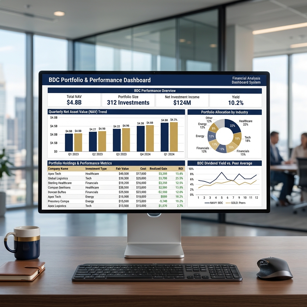
This project focused only on Business Development Company (BDC) portfolio analysis. The goal was to turn financial and portfolio-level data into an executive dashboard that explains how the BDC is performing across net asset value, investment count, income generation, dividend yield, industry allocation, and holding-level returns.
The analysis is framed around the metrics that matter to BDC stakeholders: portfolio scale, NAV trend, net investment income, yield strength, allocation mix, realized gains, and peer comparison.
Data Preparation & Dashboard Structure
I organized the BDC data into a dashboard-ready structure so performance could be reviewed from both a high-level and holding-level perspective. The workflow focused on standardizing portfolio records, calculating financial KPIs, grouping investments by industry, and preparing trend views for quarterly reporting.
- KPI preparation: Summarized total NAV, portfolio size, net investment income, and current dividend yield for fast executive review.
- Portfolio grouping: Organized holdings by company name, investment type, industry, fair value, cost, realized gain, and ROI.
- Visual reporting: Built chart views for quarterly NAV movement, industry allocation, and BDC dividend yield compared with the peer average.
Dashboard KPIs
The dashboard highlights the most important BDC performance indicators first, allowing viewers to understand portfolio scale and income performance before reviewing the detailed visuals.
| BDC Metric | Value |
|---|---|
| Total Net Asset Value (NAV) | $4.8B |
| Portfolio Size | 312 Investments |
| Net Investment Income | $124M |
| Dividend Yield | 10.2% |
These KPIs make the section about the BDC itself: how large the portfolio is, how much income it generates, how NAV is moving, and whether the yield profile is attractive compared with peers.
Visual Analysis
The dashboard visual combines four views that help explain BDC performance:
- Quarterly NAV trend: Tracks changes in net asset value across reporting periods to show whether portfolio value is expanding or contracting.
- Industry allocation: Shows exposure across healthcare, technology, financials, energy, and other sectors so concentration risk can be reviewed quickly.
- Holdings performance table: Compares fair value, cost, realized gain, and ROI at the company level to review investment-level performance.
- Dividend yield comparison: Benchmarks the BDC yield against peer averages to show relative income performance.
Business Application
This BDC-focused dashboard supports portfolio monitoring, investor reporting, and management review. It gives decision-makers a concise way to evaluate NAV growth, income generation, dividend competitiveness, sector exposure, and investment-level ROI.